Focus: Field Research, Target Audience Interviews, Brand Development, Digital Advertisements
Assignment
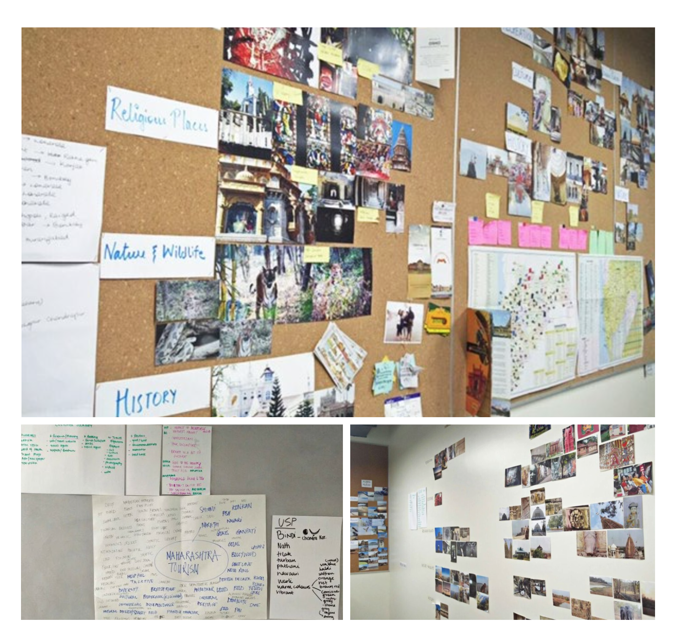
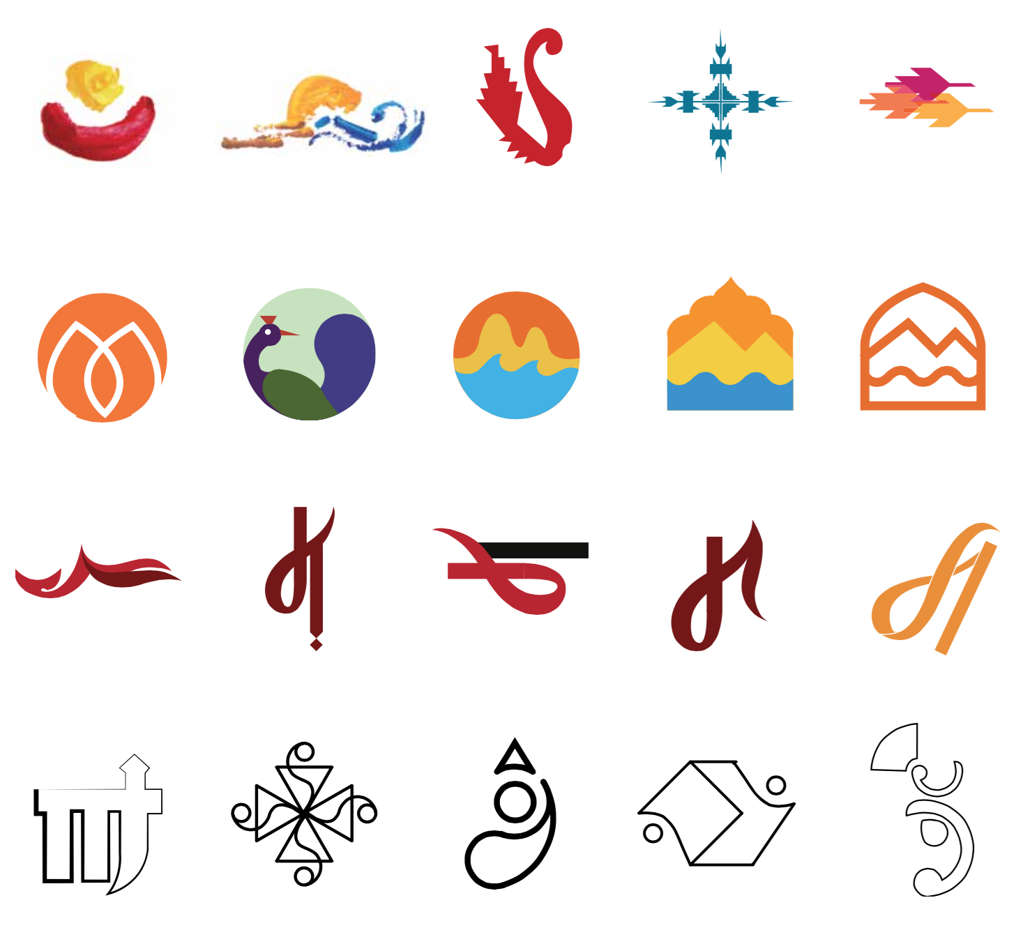
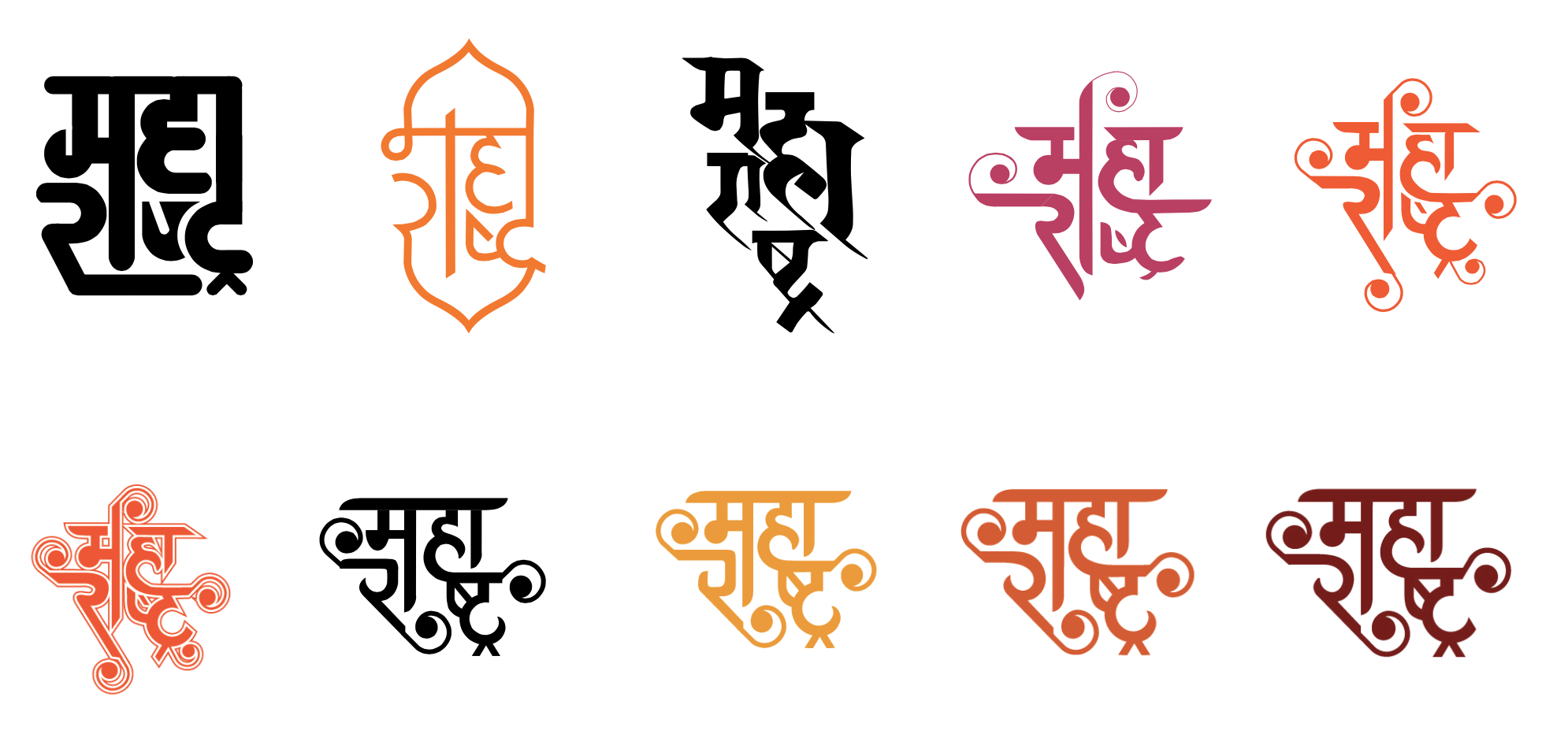
A Collaborative studio class with the goal to rebrand the state tourism, Maharashtra. A huge amount of research was involved, where we travelled to different parts of Maharashtra, gathered primary research and mainly experienced the place.
Challenge
Maharashtra, a state with abundance of culture, history, recreation and much more exciting things to do is undervalued for tourism in India. With the help of rebranding and redefining the identity of Maharashtra tourism, tourists would get attracted.
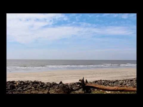
Digital advertising is one of the most effective ways of marketing one’s products or services today. I executed this as a montage of photographs and videos. The advertisements were represented as a travellers journey and his perspective of the place through photographs.
hi, thixv jbnm in
Focus: Brand Research, Rebranding
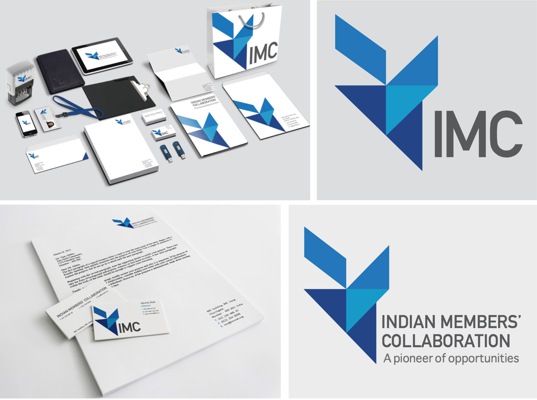
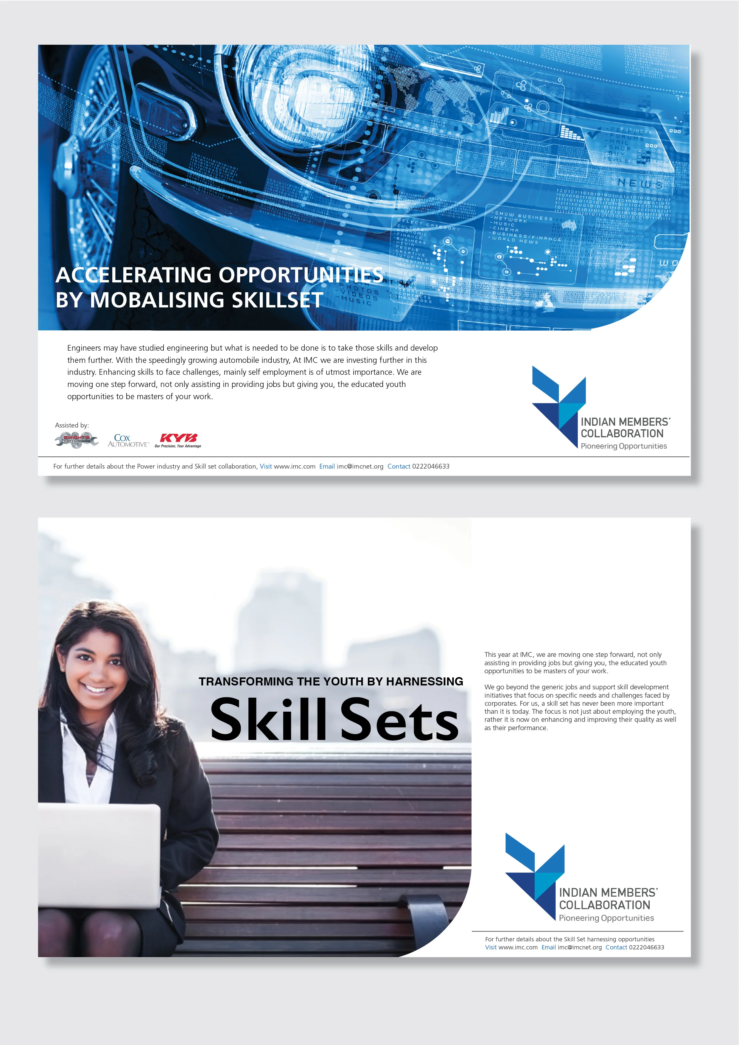
About the Client
Indian Merchant’s Chamber, the IMC, is a world class Chamber of Commerce, striving to make India a strong economic nation. It has opened new fronts, created opportunities and diversified its outreach. Its rich legacy combines a deep-rooted and broad national and global perspective.
It is currently aiming for “Job creation through the process of skill development.”
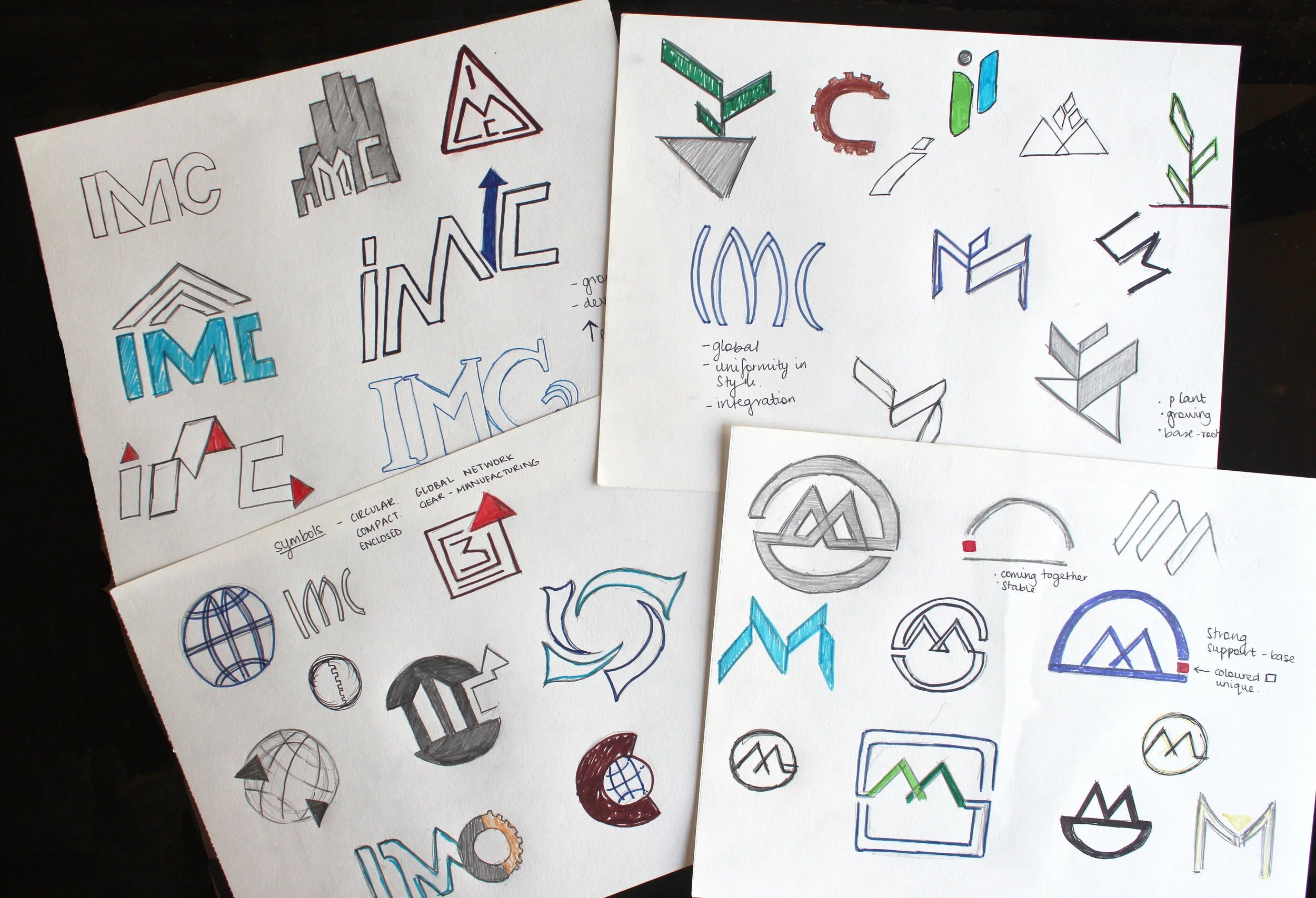
Challenge and Approach
The goal was to create an identity that worked in sync with its approach and kept true to its 100 year old timeless identity. It is an abstracted version of a growing plant, where the sharp edges and direction of the rectangles portray determination and focus. The focal point denotes the coming together of various people and industries, where the base acts as a support system.
Focus: Poster Design, Typography
A set of two posters representing the typefaces - Didot and Courier. Each one showcasing a certain problem that needs to be addressed.
Approach
The large, bold letter one seen at the beginning of every magazine article may seem to be overdone now. With emerging creativity and ways of presenting work this poster talks about the over use of the so called drop caps, using the typeface Didot.
Censorship has been seen not only in recent movies, shows, but existed since the time scripts were written using a typewriter and hence the typeface courier.